The ghost in the wordmark
The nav on this site reads URIAH CLEMMER, with RIAH knocked back to a fraction of the brightness of the letters around it. That fade is the only piece of the design I argued about with myself for more than an afternoon, and it is the piece most likely to look like an accident. It isn't decoration. It is the whole mark.
The mark is a reveal
Knock back RIAH and what is left reads U…CLEMMER. Which is uclemmer — the domain, the handle, the thing I actually answer to online. My name has my username hiding inside it, and the mark's only job is to let you notice that without being told.
Which means the reveal only works while the ghosted letters recede. The hidden word has to be the loud one. Every decision below follows from that single constraint, and any treatment that makes RIAH competitive with its neighbours destroys the mark no matter how good it looks.
Five candidates
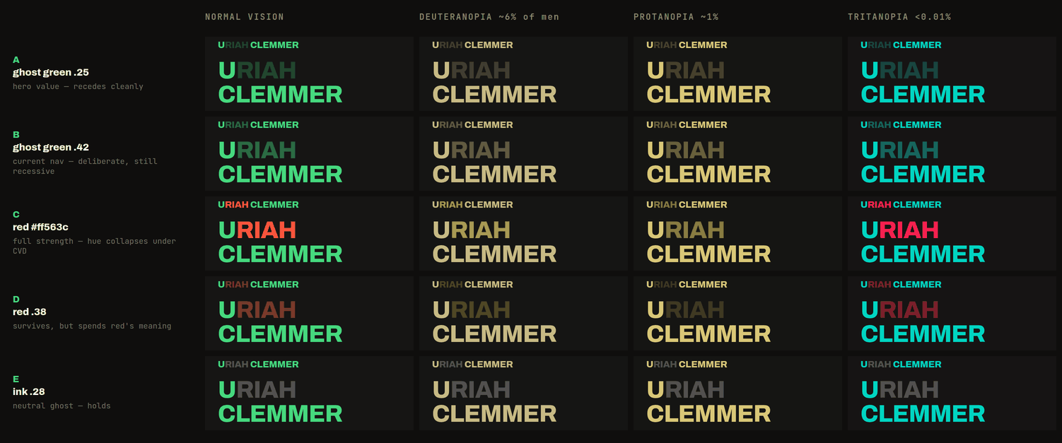
A and B are the same idea at two strengths: ghost the letters in the brand green, at 25% and 42% opacity. C paints them in the system red at full strength. D ghosts that red back to 38%. E uses a neutral — the off-white ink at 28% — instead of a brand colour at all.
Every row except C holds the hierarchy in normal vision. That is not the interesting part. The interesting part is what happens in the three columns to the right.
Why red loses
Three reasons, in increasing order of how much I weighted them.
Red is already spoken for. In this system red means act here: the CONTACT link, the terminal kickers, the poster banner at the bottom of every page. Painting the letters I am trying to suppress in the loudest colour I own produces exactly the wrong reading — URIAH clemmer — and uclemmer never surfaces.
Two reds too close together. In the nav, a red RIAH would sit about two hundred pixels from the red CONTACT link. Reuse an accent that heavily at that distance and it stops meaning anything in particular.
And it does not survive colour vision deficiency. Look at row C in the deuteranopia and protanopia columns. RIAH and CLEMMER are the same colour. Not similar — the same khaki, at almost the same brightness. For roughly six percent of men, the most carefully considered piece of the mark simply is not there.
The part I got wrong
The first version of that comparison sheet said something stronger, and I believed it for a week.
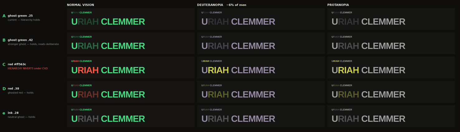
Look at the greens in its middle and right columns. They are lavender-grey. That is not what red-green colour blindness does to a green — deuteranopia and protanopia are the loss of a cone class, and both push red and green toward yellow while leaving blue nearly untouched. A green that turns purple is a bug, not a simulation.
I did not notice, because I did the responsible-looking thing next: I measured relative luminance off the rendered pixels rather than guessing at it. The measurement was honest. The image underneath it was not. Off those wrong pixels I got red at 0.661 against green at 0.267 and concluded that under deuteranopia the red goes brighter than the green — that the hierarchy inverts.
It doesn't. Run the actual transform and green stays brighter, comfortably:
                        normal vision      deuteranopia
green #46d97e     L =        0.524             0.491
red   #ff563c     L =        0.282             0.342
hue separation                   135°                3°
So the conclusion was right and the reason was wrong, which is the most dangerous shape an argument can have. What actually happens to a red ghost is not inversion. It is erasure: the hue gap between the two colours collapses from 135 degrees to about three, and two letters that were unmistakably different become the same colour with a rounding error between them. That is worse than inverting, and I would have missed it entirely if the numbers had not been suspicious enough to re-derive.
One more error came out in the wash. The old note in my design docs paired "5.9:1 in normal vision" with "4.0:1 under deuteranopia" as though they described the same treatment. They didn't — the first is the 25% ghost and the second is roughly the 42% one. Two different rows, presented as one comparison.
Why opacity survives when hue doesn't
Dichromacy costs you a cone class. It collapses hue distinctions and leaves luminance largely intact — which is why the blues in that sheet barely move while every red and green slides toward the same yellow. So a hierarchy encoded in brightness survives, and a hierarchy encoded in hue is a bet on cones that some of your readers do not have.
The numbers bear that out. The separation between full-strength and ghosted green goes from 7.3:1 to 7.0:1 under deuteranopia at the hero's 16% ghost, and from 3.7:1 to 3.6:1 at the nav's 42%. Rounding error. The mark reads the same way to everyone.
If a distinction has to survive, don't spend hue on it.
What actually changed
Not the colour. The green ghost was right the whole time; only its justification needed repairing. What changed was the strength, and only in one place.
At the nav's 17px, 25% opacity reads as a rendering artefact rather than a decision — you assume the font is failing, not that someone chose it. Row B takes it to 42%, which is still clearly recessive but unmistakably deliberate. The 148px hero stays at 16%, because at that size the ghost is enormous and any more would compete.
And row D deserves a note: red at 38% is the one red treatment that holds up in all four columns. If I wanted red in the mark, that is the only version that works. I don't — it spends the meaning of red to buy nothing the green wasn't already giving me for free.
Two rules came out of this. Hierarchy in the mark is carried by opacity, never by hue. And check the picture before you trust the measurement you took from it, because a number computed off a wrong image is far more convincing than a guess — and much harder to catch.